


There are a lot of reasons for the participation rate to have fallen so much, and the drop-off is an extraordinarily complex and difficult thing to get your data head around. But policymakers and economists want to have simple answers and solutions, so they make assumptions and then confidently tell us that their assumptions are the correct ones: This is what the data means. And they don’t bother to attach a 50-page white paper that parses all of the different variables that go into making those assumptions about the participation rate. Just saying…
My friend Lance Roberts (via Michael Lebowitz) adjusts the unemployment figure based upon a methodology that includes the people who have quit looking for jobs. He compares that adjusted rate to the U-3 rate in the chart below.
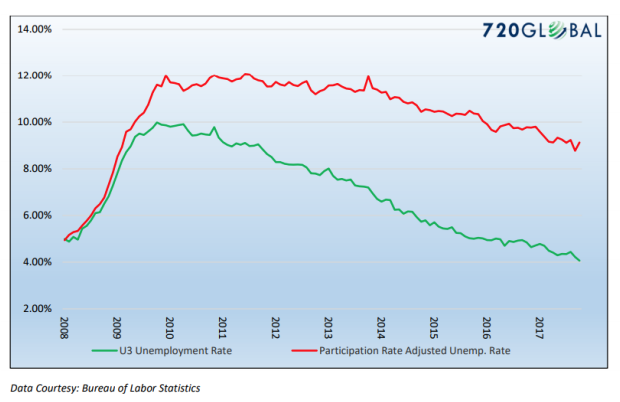
Is Lance’s number the real employment rate? I would suggest that it’s not, because a lot of people who are not in the labor force really aren’t looking for jobs. They are students, or they are on disability, and so forth. Lance performed the exercise to make us think about the employment numbers.
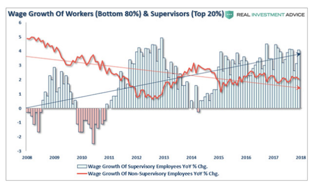
If you argue that we are at “full employment,” then it follows that you are expecting wage inflation. But that is not what we’re seeing. Eighty percent of workers are seeing very little wage growth at all. This instructive chart comes from my associate Patrick Watson’s latest Connecting the Dots letter: